Amazon Prime Redesign
A redesign proposal to enhance user experience with improved navigation, content strategy, and filter options on Amazon Prime
Project Brief
The goal of this three-week design sprint is to identify opportunities of improvement to an existing digital experience
Project Type
Group Project/ Academic
Role
UX Researcher, UX Designer
Tools
Figma, Google Forms, Zoom.
Solution
Our redesigned Amazon Prime offers improved navigation, personalized content, and easy-to-use filters, providing users with a streamlined and more enjoyable viewing experience
Problem
Despite world-wide streaming subscriptions passing one billion during pandemic, Amazon Prime's current structure and selection overwhelm users, making it difficult to find and select content to watch
A Plot Twist You Didn’t See Coming!
So, there we were, ready to put our mark on the entertainment big leagues. You know, those cinematic Goliaths like Netflix and Cineplex? Yep, we were on the brink of giving Cineplex an upgrade it didn't even know it needed. Picture this: "Online Streaming of New Releases and Watch Party.” Sounds epic, right? Imagine watching that brand new blockbuster in your pajamas, and virtually tossing popcorn at your friend's avatar because they won't stop virtual talking!
But then, plot twist! Our course instructor, playing the role of the wise mentor in our story, threw down some sage advice. Why chase after shiny new features when there’s a treasure trove of existing user problems waiting for a hero (or heroes, in our case)?
So, like any good movie protagonist, we took a step back, did a montage of research and surveys, and embarked on a new quest.
What did we find?
We ran a survey which was answered by 36 users.
83%
Users watched between 5 -10 movies in the last month
75%
Users had difficulty navigating the website
91%
Users found it difficult to decide on a movie
The results? Drumroll, please...
A whopping 40.7% said they'd dive into YouTube (probably sneaking in a cat video or two between episodes). Another 40.7% would indulge with Amazon Prime, maybe while waiting for their next Prime delivery.
But here's the plot twist: a mere 3% opted for Amazon, signaling to us that there's a vast, uncharted territory in the Amazon streaming landscape waiting for some groundbreaking improvement.
Alright, so we threw a curveball to our audience: "You want to watch something with a TV application. Which of the following applications would you choose if they all are free to use and carry the same contents?"
Unpacking User Preferences with Affinity Mapping
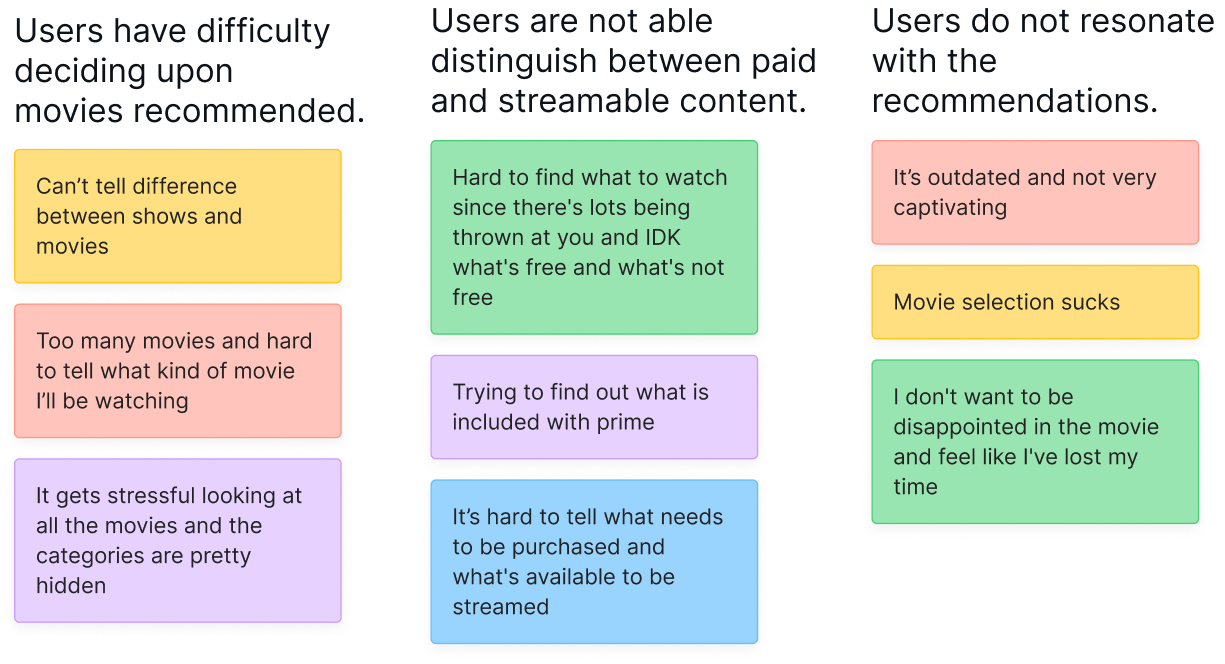
Through Affinity Mapping, we distilled vast survey data to pinpoint three major trends in the streaming landscape. These insights are pivotal, guiding us toward enhancing user experience in meaningful ways.
Meet our Persona Jamie!
Using the insights derived from our research, we shaped a user persona
How Might We?
Help Jamie filter through movies/shows with ease
Organize the layout in a more meaningful way
Assist Jamie to determine what content is included with Prime and what has an additonal fee
After
Prime presents movies & TV shows on homepage together a which is causing difficulties for users who want to find and watch specific content.
To address this problem, we separated movies and TV shows on the navigation menu to improve navigation. With this solution, users like Jamie can easily find and watch their desired show or movie without having to sift through a cluttered homepage.
Before
After
In our survey, when participants were presented with the question, "If there is a cross-selection filter, what are your top 3 criteria when searching for a movie/TV show?", the results were telling:
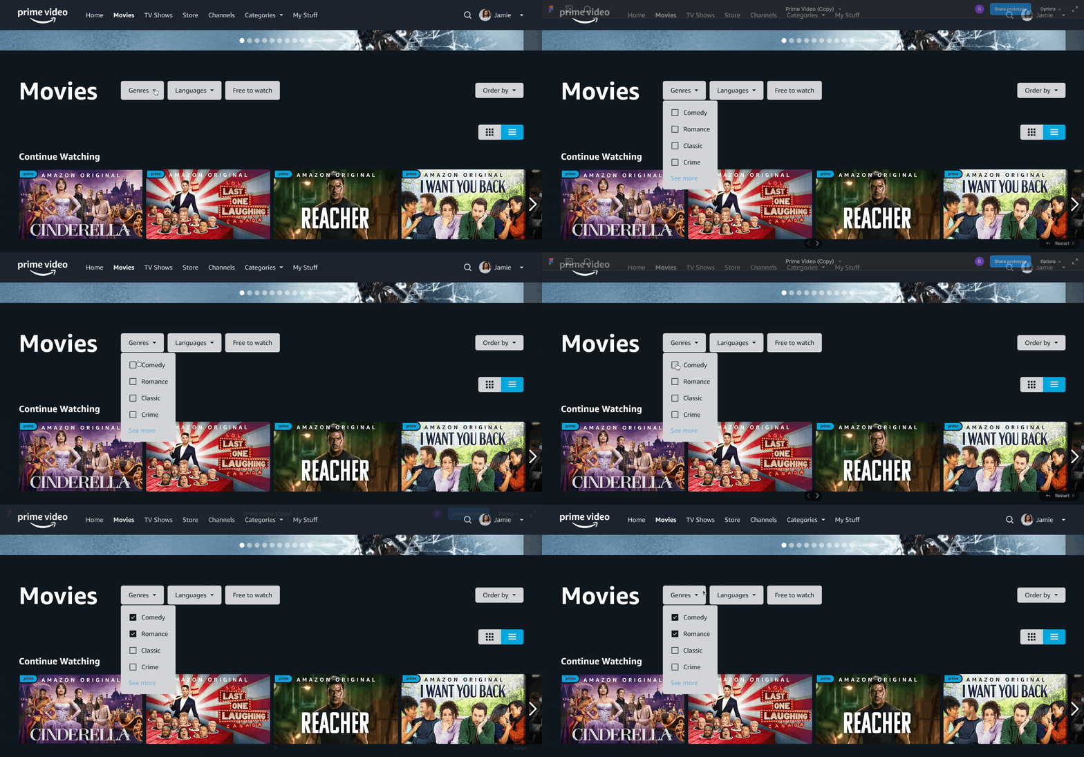
Genre and Language topped the list, with 81.5% of participants selecting these as primary search criteria.
Free to Watch was chosen by 11.1% of users each
To address this issue, we implemented filters that give users greater control over their search results.
Before
Currently users have go through a lot of scrolling to get canvas top 10 , recommend shows and to continue watching categories.
After
By including prices on tags gives users a clear indication
that they need to pay in order to watch the content
After
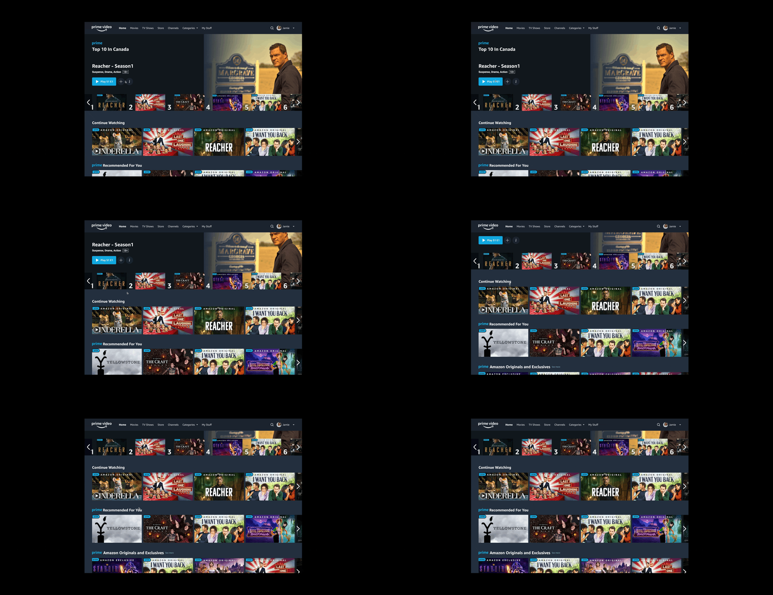
We addressed this solution by prioritising top10 to the top of the home page followed by continue watching and recommended shows.
Now users can easily pick shows as they see trending shows or catch up to ongoing shows or pic any show recommended.
Before
Prime currently has $ tag indicating store content (to be paid)
Before
When users encounter an overwhelming number of results, they struggle to make a choice. This is in line with Hick's Law, which states that decision time increases with the number and complexity of choices.
Mobile & TV
We delved into the distinct experiences of mobile and TV users on Amazon. TV viewers, interacting primarily through remotes, have unique expectations. Changes that worked on mobile, like the 'Language' filter, posed challenges on TV due to the remote's inherent constraints.
I'm keen to delve deeper into these design nuances. If you have questions or areas of interest, please let me know. Let's discuss creating seamless experiences across devices. 📺📱🖥️
What Did I learn?
Maintaining Focus: Throughout the project, it became evident how essential it is to stay aligned with a project's objectives. Pivoting and moments of uncertainty emphasised this need.
To address our project's challenges, the team engaged in alignment sessions, revisiting our primary goals to gain clarity and direction.
Avoiding Preconceived Solutions: I recognised the pitfall of approaching challenges with pre-set answers. It underscored the importance of being open-minded throughout the design process.
Usability Testing's Significance: The project underlined the importance of usability testing. While there was an effort to consider multiple viewports, the tight three-week timeline constrained my ability to conduct extensive usability testing for the TV prototype.
Next Steps
Given the insights from this project, in future endeavours with more flexible timelines, I will prioritise allocating sufficient time for thorough usability testing, especially when addressing varied user platforms.
These lessons will undoubtedly have shaped my approach in subsequent projects, driving better results and more refined user experiences.


